KTF 06: Metro Roman, Blueline, Sport, Botanical, Xarkiv


Preface
Credits
Echoing WWII events, in 2022 Kyiv Metro became the bomb shelter for thousands of its inhabitants. This sad fact is another big milestone in its rich history, which continues to be written. Built six decades ago, it carries 1.32 mln. passengers a day (2016) and is one of the most beautiful manmade creations in Ukraine. As part of station architecture, the letters of the Kyiv metro tell us a lot about its history. It's a book. You can read it in many directions. Exiting on each station, you'll notice different letterings. “Look at them, analyze and make fonts on their basis”, we told to our students in our summer 2023 workshop called “Kyiv Metro Fonts”.
Font production:
Vadym Aksieiev
Yevgen Anfalov
Nazariy Kondratiuk
Dasha Lennhren
Matvii Masliukov
Specimen help:
Ostap Yashchuk
Special thanks:
Vadym Aksieiev for the vibez
Nazariy Kondratiuk for assistance
Oleg Totsky, Jan Horčík
Code and integration:
Code and integration:
Oles Gergun (grandwizard)
Arsen Batyuchok
Arsen Batyuchok
So they did it within a week, and we took and carefully finished 5 most representative of them. The result is a family release called KTF Metro, aiming to preserve the typographic memory of the city. Additionally, Yevgen Anfalov interviewed Oleg Totsky, a metro historian. His answers open up a context in which Kyiv Metro letters emerged and supplement the showcased typefaces respectively. KTF Metro is free for Ukrainians. For the rest of the world: as Ukraine is still in the state of emergency, we'd like to ask you for a donation. Use our PayPal, and we'll distribute the money among those in a need and report in 2024.
Students:
Olesia Bachynska
Roman Baranovsky
Galya Dautova
Andriy Holubokiy
Nazariy Kondratiuk
Dasha Lennhren
Mykita Maltsev
Matvii Masliukov
Ostap Yashchuk
Oleksandr Piddubniy
Yevhen Spizhovyi
Workshop mentors:
Yevgen Anfalov
Oles Gergun
Y.A. Regarding casting, was it outsourced, or was it made in-house?
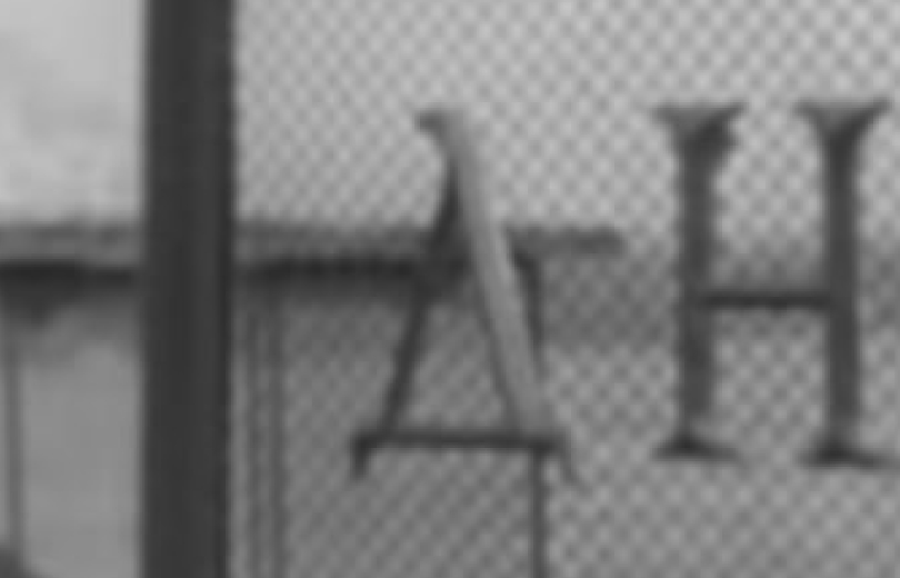
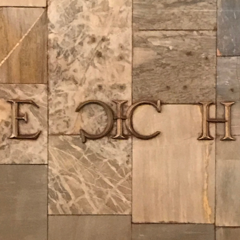
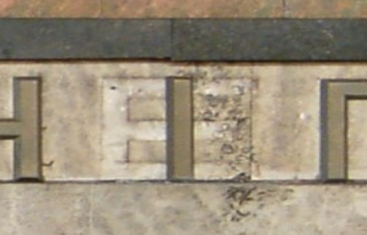
O.T. I think it was made in the metro since there are many repair shops and rooms there. I know that in one of the newspaper articles in the early 90s, this problem was discussed. Like, “They renamed the station, but never cared about the casting.” And there is also the Maidan Nezalezhnosti station where there is a very strange letter “Em” and an even stranger letter “Zhe”, made from two “Es” and an “I”. If you look at the names of the stations that used this font, in none of them was an “Ef” or “Em”. Most likely, casting was not done for these letters. I guess, at the time of renaming, it was necessary to quickly construct these letters out of something. They didn't bother with original forms.
Y.A. I won't change this faulty “Zhe”.
Y.A. Regarding casting, was it outsourced, or was it made in-house?
O.T. I think it was made in the metro since there are many repair shops and rooms there. I know that in one of the newspaper articles in the early 90s, this problem was discussed. Like, “They renamed the station, but never cared about the casting.” And there is also the Maidan Nezalezhnosti station where there is a very strange letter “Em” and an even stranger letter “Zhe”, made from two “Es” and an “I”. If you look at the names of the stations that used this font, in none of them was an “Ef” or “Em”. Most likely, casting was not done for these letters. I guess, at the time of renaming, it was necessary to quickly construct these letters out of something. They didn't bother with original forms.
Y.A. I won't change this faulty “Zhe”.
This blatant incorrectness reflects the era, it can stand as an edification for further generations, a document, don't you think?
O.T. I would agree if it weren't for the name of the station. You arrive at the station, which is proudly called Maidan Nezalezhnosti (Independence Square), where everything is plastered with advertising, marble is being crushed, and then there are these “letters”. C'mon.
O.T. I would agree if it weren't for the name of the station. You arrive at the station, which is proudly called Maidan Nezalezhnosti (Independence Square), where everything is plastered with advertising, marble is being crushed, and then there are these “letters”. C'mon.
Y.A. Can you do a historical excursion for us?
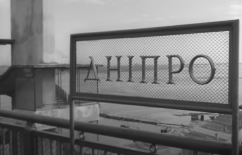
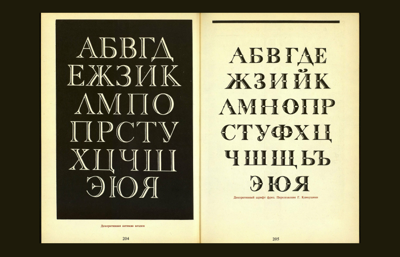
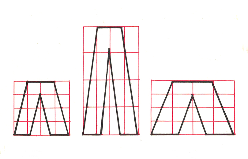
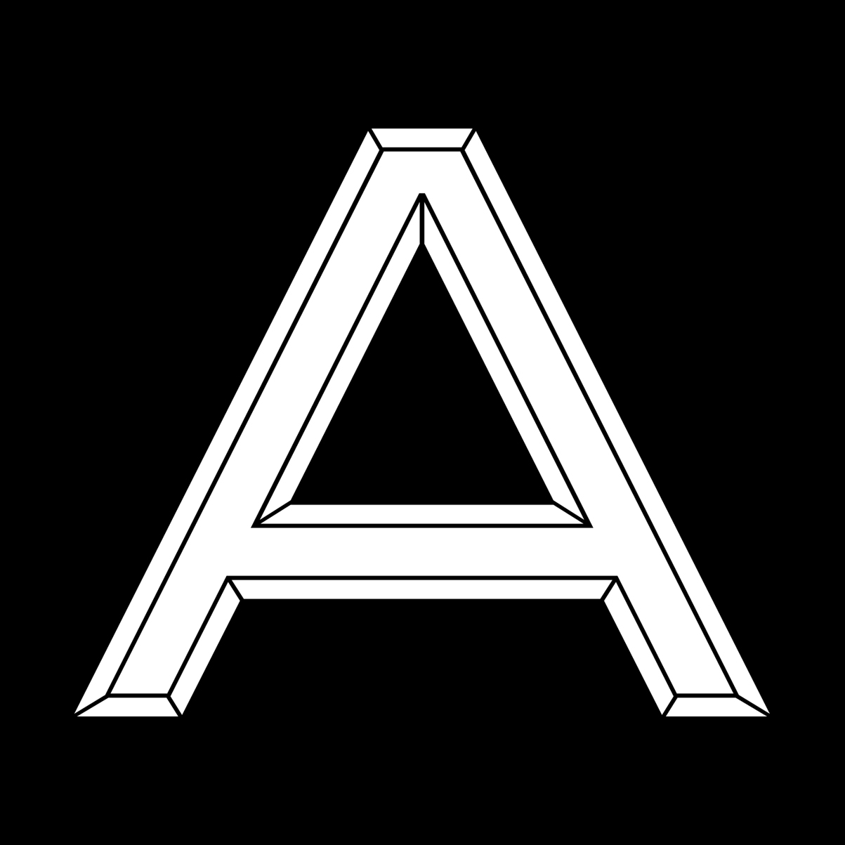
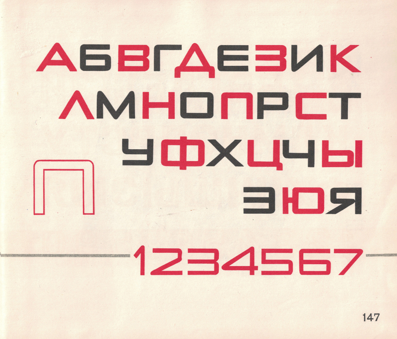
O.T. If we take the first seven stations from the Dnipro to the modern Shulyavska (except for Teatralna) – they inherited the design of the Ring Line of the Moscow metro, from where the letters came to St. Petersburg in 1955. And then they came to us in 1960–63. During the Stalin era, this monumental style of Roman capital letters was popular. It should be noted that the Moscow metro in 1935 did not immediately acquire Stalinist architecture. It was preceded by the avant-garde, but it was all quickly curtailed since the party subtly hinted that now we would have a return to the classics. There are similar fonts in Soviet books (like Klikushin for instance) and catalogs, but the exact origin and author could not be established. It feels like drawings of these letters were made specifically for the metro, but they were taken and creatively modified in some parts. This can be seen in the letters De and El with their peculiar upper serifs (see below). About the letter “K”: In Cyrillic adaptations, the diagonals were usually changed to curled forms. In the metro font, the Cyrillic “K” copies the Latin version.
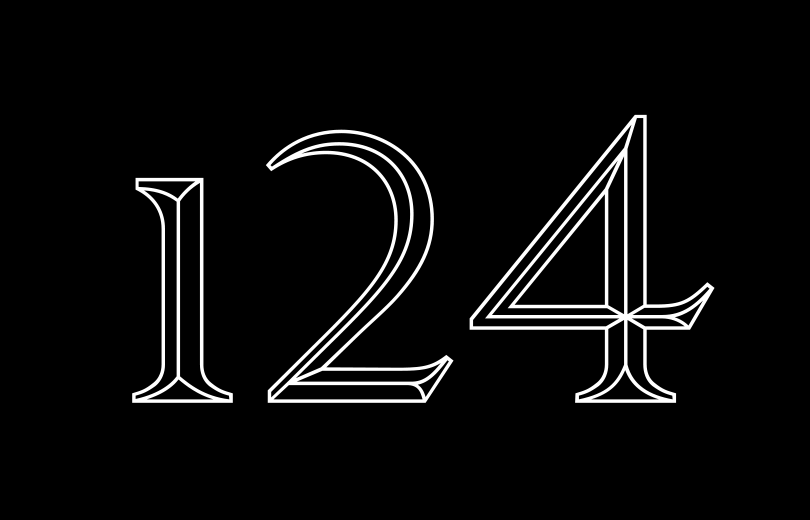
Notabene: Our version is based on the “Antiqua” letters most frequently used on walls of Red Line. In a way, it represents it. We had to invent the missing letters, especially in Latin, which wasn't a complex task since this font is based on the most classical uppercase model. We call it KTF Metro “Roman”, to pay tribute to the monumental style of Roman capitals. On the tiles or marble in Kyiv Metro, these brass letters look pretty amazing. When researching the most suitable numbers, we found a set of old style numerals presented in “Schriften Lettering Ecritures” by Walter Käch (1949). They share similar short serifs with our font and were convincing in their carved three-dimensionality, which also fits the matter of our subject: KTF Metro Roman is a revival of metal letters, mimicking stone carving in the reverted way.
Y.A. Can you do a historical excursion for us?
O.T. If we take the first seven stations from the Dnipro to the modern Shulyavska (except for Teatralna) – they inherited the design of the Ring Line of the Moscow metro, from where the letters came to St. Petersburg in 1955. And then they came to us in 1960–63. During the Stalin era, this monumental style of Roman capital letters was popular. It should be noted that the Moscow metro in 1935 did not immediately acquire Stalinist architecture. It was preceded by the avant-garde, but it was all quickly curtailed since the party subtly hinted that now we would have a return to the classics. There are similar fonts in Soviet books (like Klikushin for instance) and catalogs, but the exact origin and author could not be established. It feels like drawings of these letters were made specifically for the metro, but they were taken and creatively modified in some parts. This can be seen in the letters De and El with their peculiar upper serifs (see below). About the letter “K”: In Cyrillic adaptations, the diagonals were usually changed to curled forms. In the metro font, the Cyrillic “K” copies the Latin version.
Notabene: Our version is based on the “Antiqua” letters most frequently used on walls of Red Line. In a way, it represents it. We had to invent the missing letters, especially in Latin, which wasn't a complex task since this font is based on the most classical uppercase model. We call it KTF Metro “Roman”, to pay tribute to the monumental style of Roman capitals. On the tiles or marble in Kyiv Metro, these brass letters look pretty amazing. When researching the most suitable numbers, we found a set of old style numerals presented in “Schriften Lettering Ecritures” by Walter Käch (1949). They share similar short serifs with our font and were convincing in their carved three-dimensionality, which also fits the matter of our subject: KTF Metro Roman is a revival of metal letters, mimicking stone carving in the reverted way.
Y.A. What is generally known about the names of Kyiv metro stations?
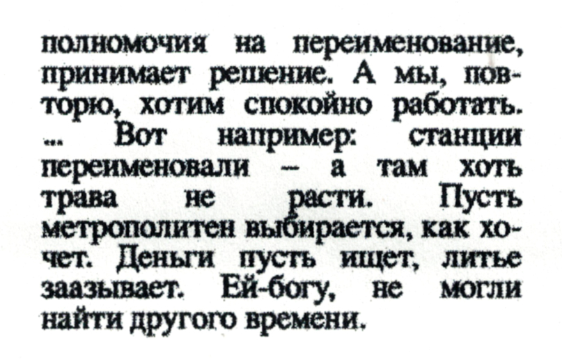
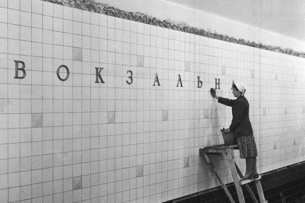
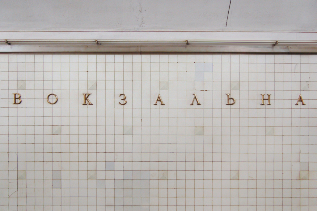
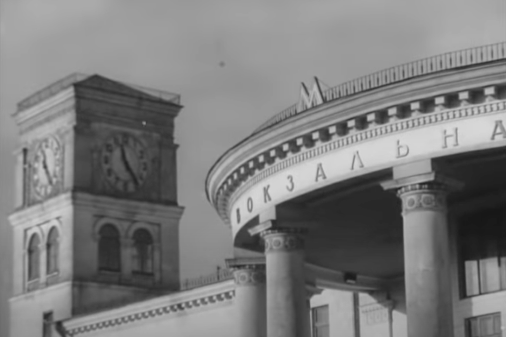
O.T. The metro station names on the track wall have always been there. It is not clear where this tradition came from. In a way, it is similar to the train stations. Funnily, the title was often put somewhere above, and in such a way that neither arriving nor departing could see it. A strange tradition from the 19th century, which probably transferred to the metro. Up to a certain point, it was perceived as part of navigation. I guess, the architects realized that it didn't work as navigation, and, from the late 80s to early 90s, they began to do whatever they wanted. Different individual letterings have appeared for each station, and in some cases, it is no longer so easy to read what is written there. When the 2000s arrived, they began to use foreign fonts (Benguiat, Arial Bold – editor's note), not knowing that they needed to purchase a license, or that the letters could not be deformed. In my opinion, and in the opinion of many navigation designers, these letters on the station wall do not carry any special function in terms of navigation. Moreover, when you get off the train, the inscription is behind you. It is not visible at all. When they decided to rename Druzhby Narodiv to Zvirynetska, a big online dispute began about the readability of the lettering.
Kievskyi Vestnik Nr. 88, 1993. An excerpt from the newspaper article about station renaming called “Dismantle the medal, metro and the name, too”.

Y.A. What is generally known about the names of Kyiv metro stations?
O.T. The metro station names on the track wall have always been there. It is not clear where this tradition came from. In a way, it is similar to the train stations. Funnily, the title was often put somewhere above, and in such a way that neither arriving nor departing could see it. A strange tradition from the 19th century, which probably transferred to the metro. Up to a certain point, it was perceived as part of navigation. I guess, the architects realized that it didn't work as navigation, and, from the late 80s to early 90s, they began to do whatever they wanted.
Different individual letterings have appeared for each station, and in some cases, it is no longer so easy to read what is written there. When the 2000s arrived, they began to use foreign fonts (Benguiat, Arial Bold – editor's note), not knowing that they needed to purchase a license, or that the letters could not be deformed. In my opinion, and in the opinion of many navigation designers, these letters on the station wall do not carry any special function in terms of navigation. Moreover, when you get off the train, the inscription is behind you. It is not visible at all. When they decided to rename Druzhby Narodiv to Zvirynetska, a big online dispute began about the readability of the lettering.
Y.A. Regarding casting, was it outsourced, or was it made in-house?
O.T. I think it was made in the metro since there are many repair shops and rooms there. I know that in one of the newspaper articles in the early 90s, this problem was discussed. Like, “They renamed the station, but never cared about the casting.” And there is also the Maidan Nezalezhnosti station where there is a very strange letter “Em” and an even stranger letter “Zhe”, made from two “Es” and an “I”. If you look at the names of the stations that used this font, in none of them was an “Ef” or “Em”. Most likely, casting was not done for these letters.
“Schriften Lettering Ecritures” by Walter Käch, 1949
I guess, at the time of renaming, it was necessary to quickly construct these letters out of something. They didn't bother with original forms.
Y.A. I won't change this faulty “Zhe”. This blatant incorrectness reflects the era, it can stand as an edification for further generations, a document, don't you think?
O.T. I would agree if it weren't for the name of the station. You arrive at the station, which is proudly called Maidan Nezalezhnosti (Independence Square), where everything is plastered with advertising, marble is being crushed, and then there are these “letters”. C'mon.

About the letter “K”: In Cyrillic adaptations, the diagonals were usually changed to curled forms. In the metro font, the Cyrillic “K” copies the Latin version.
Notabene: Our version is based on the “Antiqua” letters most frequently used on walls of Red Line. In a way, it represents it. We had to invent the missing letters, especially in Latin, which wasn't a complex task since this font is based on the most classical uppercase model. We call it KTF Metro “Roman”, to pay tribute to the monumental style of Roman capitals. On the tiles or marble in Kyiv Metro, these brass letters look pretty amazing. When researching the most suitable numbers, we found a set of old style numerals presented in “Schriften Lettering Ecritures” by Walter Käch (1949). They share similar short serifs with our font and were convincing in their carved three-dimensionality, which also fits the matter of our subject: KTF Metro Roman is a revival of metal letters, mimicking stone carving in the reverted way.
Y.A. Can you do a historical excursion for us?
O.T. If we take the first seven stations from the Dnipro to the modern Shulyavska (except for Teatralna) – they inherited the design of the Ring Line of the Moscow metro, from where the letters came to St. Petersburg in 1955. And then they came to us in 1960–63. During the Stalin era, this monumental style of Roman capital letters was popular. It should be noted that the Moscow metro in 1935 did not immediately acquire Stalinist architecture. It was preceded by the avant-garde, but it was all quickly curtailed since the party subtly hinted that now we would have a return to the classics. There are similar fonts in Soviet books (like Klikushin for instance) and catalogs, but the exact origin and author could not be established. It feels like drawings of these letters were made specifically for the metro, but they were taken and creatively modified in some parts. This can be seen in the letters De and El with their peculiar upper serifs (see below).
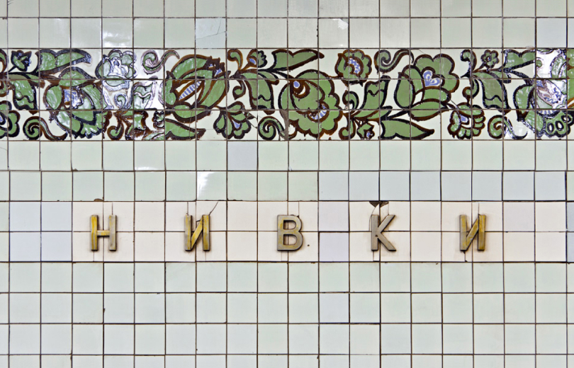
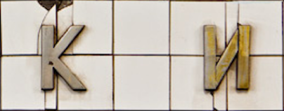
Nyvki station wall
O. Snarsky, on letter proportioning

Notabene: In fact, this font was kind of an industry-standard, cast all over the Soviet Union of the same molds. Among us we called this Face “DIN”, referring to “Deutsche Industrienorm” a well-known font of similar proportions and an “O” with straight sides. Our students Yevhen Spizhovyi, Roman Baranovsky, and Oleksandr Piddubniy were working on different variations of the same font. Most characteristics are two versions of the “Ka” and “Zhe” respectively, both of which we kept. The result will come as a future update. The name KTF Contract refers to Kontraktova Square station, sounding as pragmatic as the font's functionalist aesthetic.
O.T. The next, more common font, probably even more common than the serif, dates back to 1971, when Beresteys'ka (then Zhovtneva), Nyvki, and Svyatoshino were opened. It also used to be on Kalinin Square (now Maidan Nezalezhnosti), and now it is on Poshtova Square and Kontraktova Square (in a slightly modified form after being renamed from Chervona Square). In the USSR it was probably the most widespread metal lettering style used in metro stations. Initially made for station walls, it migrated to the metro station entrances, and then even to monuments, etc. The author remains unknown. To me, it looks a bit like Grotesk from the Soviet children's alphabet Book “Bukvar'”.
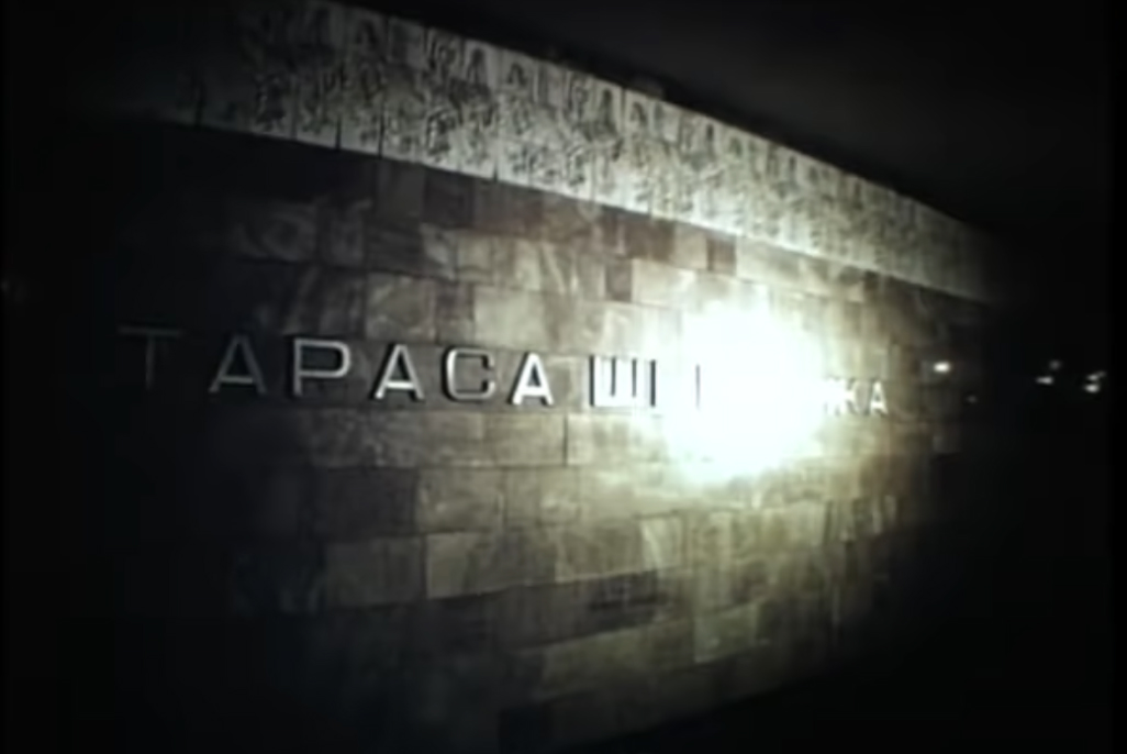
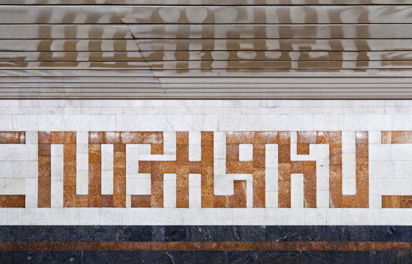
O.T. Then there is a series of Blue Line stations from 1980 to 1984, with a characteristic square font reminiscent of “Europe” (Aldo Novarese's Eurostile, editor's note). The exception is Leo Tolstoy Square, the interior of which, according to the architect's idea, was supposed to resemble the ballroom from the novel “War and Peace” by Leo Tolstoy, so the old serif font appeared there again. The Blue Line font remained on Olimpiyska, Tarasa Shevchenka, Heroes of Dnipro, and Minska.
Replaced letters after derussification
Three-dimensional drawing
These letters have become the hallmark of the Kyiv metro, although no one ever talks about it. This font was used in other metros, although in a slightly modified form. For some reason, it didn't stay there for a long time. However, in Kyiv it took root. During the renaming, the square letters disappeared, after renaming Petrivka into Pochayna, for instance. Notabene: wide, TV screen-alike letters of Eurostile were popular in the late 70-es worldwide, representing technological optimism and progress.
O.T. Then there is a series of Blue Line stations from 1980 to 1984, with a characteristic square font reminiscent of “Europe” (Aldo Novarese's Eurostile, editor's note). The exception is Leo Tolstoy Square, the interior of which, according to the architect's idea, was supposed to resemble the ballroom from the novel “War and Peace” by Leo Tolstoy, so the old serif font appeared there again. The Blue Line font remained on Olimpiyska, Tarasa Shevchenka, Heroes of Dnipro, and Minska. These letters have become the hallmark of the Kyiv metro, although no one ever talks about it. This font was used in other metros, although in a slightly modified form. For some reason, it didn't stay there for a long time. However, in Kyiv it took root. During the renaming, the square letters disappeared, after renaming Petrivka into Pochayna, for instance. Notabene: wide, TV screen-alike letters of Eurostile were popular in the late 70-es worldwide, representing technological optimism and progress.
Aldo Novarese on Eurostile. Pagina magazine, 1964

Y.A. What to do with the dominance of advertising, which eats up architecture, are there any attempts on the part of the authorities to fight this, to be more strict about preserving the metro as an architectural monument?
O.T. At the city level, no one, with the exception of a few, is interested in this. There is reason to believe that the dominance of advertising, both before and now, is associated with cash flows that go past the cash register. Our officials have learned to say at every opportunity what a beautiful and unique metro we have. But when needs arise, no one cares about this “uniqueness”. They repair something, and some unique ornament disappears. So it falls apart piece by piece. Speaking of the city, it is not necessary to preserve every single house. More important is to preserve the integrity of the historical landscape, small forms, and surroundings. Then you can perceive the history and atmosphere as a whole.
Y.A. Do you think the new design proposals for renaming stations fit into the original architectural concept? Shouldn't we adhere to a holistic image, the author's idea?
O.T. Let’s start with architecture. If we talk about Zvirinetska, it's quite simple: the station's architecture is neutral, and the new name fits in quite well. If we talk about Leo Tolstoy Square (Square of Ukrainian Heroes), then everything is much worse. There were a lot of discussions about toponymic confusion: there are Heroes of Dnipro, here there are Heroes of Ukraine. I'm not happy with the fact that the station's architecture was originally conceived as a kind of image with the atmosphere of Natasha Rostova's first ball from the novel “War and Peace.” If you look at the shape of the pylons, it really resembles the development of the wall of a ballroom, an allusion to chandeliers. Let's imagine a book about the history of the metro, where the author tries to describe it objectively and not hide inconvenient moments.
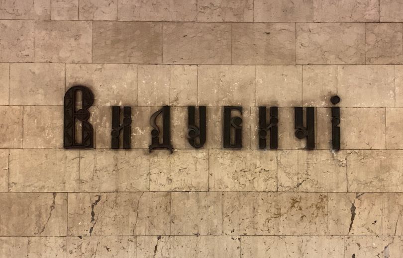
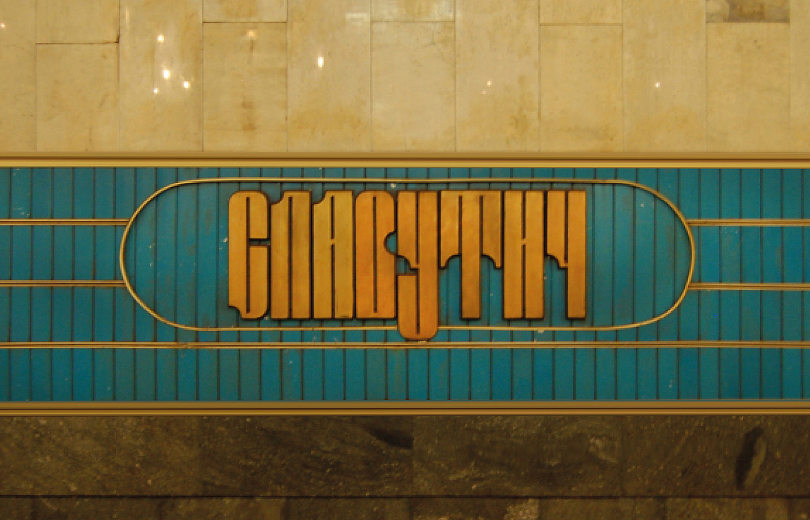
O.T. Then comes a time for eclectic solutions. For a bunch of stations of the late 80s, and early 90s such as the Palats Sportu, Mechnikova Square (Klovska), Pecherska, Druzhby Narodiv, Vydubichi, etc., the letterings were developed individually. Strange stories happened. For example, the font on Zoloti Vorota was developed by Moscow architects at Metrotrans for the initial project of this station, which they won in 1980 at an architectural competition in Kyiv. In 1989 they were kicked out of there, that was a different story, but the letters had already been cast and they stayed. Then these letters were slightly changed and used on Osokorki and Pecherska. There was a separate person in the metro who actively promoted it, saying that it was the typography of Kyivan Rus. Later, “references” to Kyivan Rus appeared in letters on Vydubychi, Poznyaki, and Teremki. A similar but more modernist take was made in Druzhby Narodiv and Slavutych. The letters were designed by Nikolai Alyoshkin, the architect from the Metroprojekt, which he specially developed for his architectural designs.
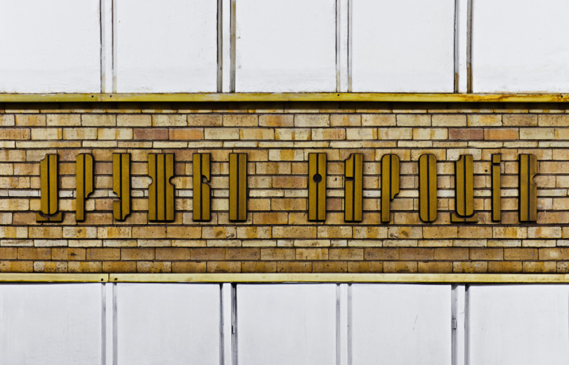
Kharkivs'ka lettering is made of tiles
When a church replica built anew stands alone among offices, kiosks, and other crap, this is not the preservation of the historical environment, but profanation. We have a lot of this, and we don’t see any change.
Y.A. How can this be resisted?
O.T. The question is not easy. So far, it is possible to force them to move somewhere in the right direction only with the help of public outcry. However, society as a whole also does not see the value in most metro stations, much less in preserving individual architectural details. When variants of the new Zvirynets’ka lettering appeared, there was immediately a huge number of people who came up with a million reasons why the old lettering isn't important and should be dismantled. But I am sure that many of them would be happy to discuss the importance of preserving Ukrainian history. It's quite sad indeed.
Y.A. What to do with the dominance of advertising, which eats up architecture, are there any attempts on the part of the authorities to fight this, to be more strict about preserving the metro as an architectural monument?
O.T. At the city level, no one, with the exception of a few, is interested in this. There is reason to believe that the dominance of advertising, both before and now, is associated with cash flows that go past the cash register. Our officials have learned to say at every opportunity what a beautiful and unique metro we have. But when needs arise, no one cares about this “uniqueness”. They repair something, and some unique ornament disappears. So it falls apart piece by piece. Speaking of the city, it is not necessary to preserve every single house. More important is to preserve the integrity of the historical landscape, small forms, and surroundings. Then you can perceive the history and atmosphere as a whole. When a church replica built anew stands alone among offices, kiosks, and other crap, this is not the preservation of the historical environment, but profanation. We have a lot of this, and we don’t see any change.
Y.A. How can this be resisted?
O.T. The question is not easy. So far, it is possible to force them to move somewhere in the right direction only with the help of public outcry. However, society as a whole also does not see the value in most metro stations, much less in preserving individual architectural details. When variants of the new Zvirynets’ka lettering appeared, there was immediately a huge number of people who came up with a million reasons why the old lettering isn't important and should be dismantled. But I am sure that many of them would be happy to discuss the importance of preserving Ukrainian history. It's quite sad indeed.


Y.A. Do you think the new design proposals for renaming stations fit into the original architectural concept? Shouldn't we adhere to a holistic image, the author's idea?
O.T. Let’s start with architecture. If we talk about Zvirinetska, it's quite simple: the station's architecture is neutral, and the new name fits in quite well. If we talk about Leo Tolstoy Square (Square of Ukrainian Heroes), then everything is much worse. There were a lot of discussions about toponymic confusion: there are Heroes of Dnipro, here there are Heroes of Ukraine. I'm not happy with the fact that the station's architecture was originally conceived as a kind of image with the atmosphere of Natasha Rostova's first ball from the novel “War and Peace.” If you look at the shape of the pylons, it really resembles the development of the wall of a ballroom, an allusion to chandeliers. Let's imagine a book about the history of the metro, where the author tries to describe it objectively and not hide inconvenient moments. How will the phrase “architecture of station pl. Ukrainian Heroes is dedicated to the work of the Russian writer Leo Tolstoy” be perceived? I think “Bessarabska” would be better there, as it's more neutral. And pulling something over something because “the people are asking,” (whereas it's unclear which people) is a vague idea, to put it mildly. As for the lettering, I think that since they have become part of history, they should be preserved as much as possible. However, one point comes into play: the opinion of the authors themselves. In particular, the aforementioned Alyoshkin said that the font of Druzhby Narodiv for the opening of the station did not turn out so good, because it was done hastily, and he quite likes the new version. It turns out that we want to preserve the authenticity, but on the other hand, we have to fight with the author's opinion. For Druzhby Narodiv, I would keep the original font; it can easily be transformed into the Zvirynets'ka inscription. The serif of Leo Tolstoy Square is more replaceable, though.
How will the phrase “architecture of station pl. Ukrainian Heroes is dedicated to the work of the Russian writer Leo Tolstoy” be perceived? I think “Bessarabska” would be better there, as it's more neutral. And pulling something over something because “the people are asking,” (whereas it's unclear which people) is a vague idea, to put it mildly. As for the lettering, I think that since they have become part of history, they should be preserved as much as possible. However, one point comes into play: the opinion of the authors themselves. In particular, the aforementioned Alyoshkin said that the font of Druzhby Narodiv for the opening of the station did not turn out so good, because it was done hastily, and he quite likes the new version. It turns out that we want to preserve the authenticity, but on the other hand, we have to fight with the author's opinion. For Druzhby Narodiv, I would keep the original font; it can easily be transformed into the Zvirynets'ka inscription. The serif of Leo Tolstoy Square is more replaceable, though.
O.T. Then comes a time for eclectic solutions. For a bunch of stations of the late 80s, and early 90s such as the Palats Sportu, Mechnikova Square (Klovska), Pecherska, Druzhby Narodiv, Vydubichi, etc., the letterings were developed individually. Strange stories happened. For example, the font on Zoloti Vorota was developed by Moscow architects at Metrotrans for the initial project of this station, which they won in 1980 at an architectural competition in Kyiv. In 1989 they were kicked out of there, that was a different story, but the letters had already been cast and they stayed. Then these letters were slightly changed and used on Osokorki and Pecherska. There was a separate person in the metro who actively promoted it, saying that it was the typography of Kyivan Rus. Later, “references” to Kyivan Rus appeared in letters on Vydubychi, Poznyaki, and Teremki. A similar but more modernist take was made in Druzhby Narodiv and Slavutych. The letters were designed by Nikolai Alyoshkin, the architect from the Metroprojekt, which he specially developed for his architectural designs. During the massive renamings of 1990–93, everything got mixed up and the old Antiqua (see KTF Metro Roman) was used as a replacement font. When renaming or decommunizing, we don't have a tradition to put something adequate, we just want to remove things quickly. Therefore, a strange, chaotic mixture emerged.
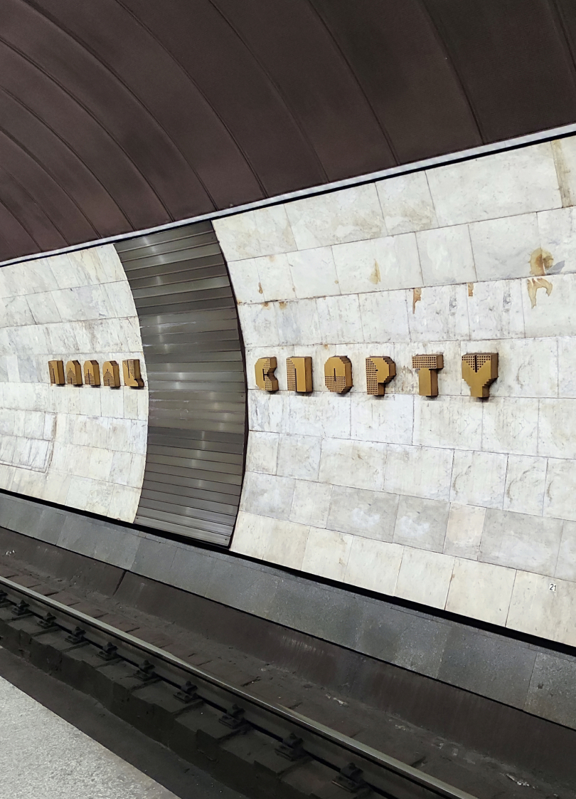
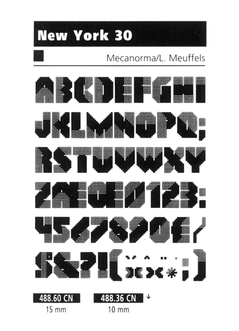
Notabene: we took the most different letterings and made faithful reconstructions of them. Curious find along the way was Yasaburo Kuwayama's book “International Logotypes” from 1990, where we found the same letters as in Palats Sportu. Thanks to Florian Hardwig, we found out the original: it's called New York 30 and was made by Dutch designer Leo Meuffels for Mecanorma (French analog to Letraset) in 1984. It is likely that the Mecanorma catalog got into Alyoshkin's hands. Alyoshkin says: “I don't remember where I saw these letters. We cast them in Novohrad Volynsky, but I wasn't happy about their size. They should have been bigger. Bronze was very expensive in the USSR”.
During the massive renamings of 1990–93, everything got mixed up and the old Antiqua (see KTF Metro Roman) was used as a replacement font. When renaming or decommunizing, we don't have a tradition to put something adequate, we just want to remove things quickly. Therefore, a strange, chaotic mixture emerged.
Notabene: we took the most different letterings and made faithful reconstructions of them. Curious find along the way was Yasaburo Kuwayama's book “International Logotypes” from 1990, where we found the same letters as in Palats Sportu. Thanks to Florian Hardwig, we found out the original: it's called New York 30 and was made by Dutch designer Leo Meuffels for Mecanorma (French analog to Letraset) in 1984. It is likely that the Mecanorma catalog got into Alyoshkin's hands. Alyoshkin says: “I don't remember where I saw these letters. We cast them in Novohrad Volynsky, but I wasn't happy about their size. They should have been bigger. Bronze was very expensive in the USSR”.


made with